Musings of a PostgreSQL Data Pontiff Episode 2 - Hot Magick; Analytics and Graphical Output with PL/R
Welcome to Episode 2 of the "Musings of a PostgreSQL Data Pontiff" series! In this installment I’m aiming to achieve three objectives. First, you should see how the SQL language, as implemented by PostgreSQL, can perform interesting data analysis through the built-in aggregates and other capabilities such as Common Table Expressions (CTEs) and Window Functions. Second, you will get to see how native SQL combines with R code in PL/R in useful ways. And finally, I’ll show how to use PL/R to tap into the R language's ability to generate visual graphics which facilitates understanding the calculated values. So let's get started.
Background
By now you may be wondering, what's with the title of the episode? Why "Hot Magick"? Well, to begin with I thought it was catchy ;-). But seriously, it has a purpose. The example data that I will use for the rest of the episode is historical daily maximum temperature data captured by NOAA weather stations in various locations around the USA. That explains the "hot" part. The reference to "Magick" is a bow to an R package called "magick" which uses libmagick to generate and capture plotted data. More on that later.
One disclaimer is pertinent here, and for the rest of the episodes of this series. While I like to have real data to illustrate the capabilities of PostgreSQL and R when used together, I am not a proper "Data Scientist". In particular to the examples herein, additionally I am not a "Climate Scientist". So please understand that my point is not to draw definitive conclusions about climate change, it is to show off the cool capabilities of the tools I am using.
Source Data
The data can be downloaded from NOAA. The process involves the following:
- Enter a location
- Select "Daily Summaries" + date range + "Air Temperature"
- Click on a specific weather station on the map
- Add the request to the cart
- Repeat for other weather stations as desired
- Check out using "Custom GHCN-Daily CSV"
- Submit order
- Get data from download link once ready
The downloaded data will fit neatly into a table with the following structure:
CREATE TABLE temp_obs
(
  station text,
  name text,
  obs_date date,
  tmax int,
  tmin int,
  tobs int,
  PRIMARY KEY (obs_date, station)
);
Most of those field names should be pretty self-explanatory. The tobs column
represents the observed temperature at a specific time of day. In at least one
case that appeared to be 1600 (4 PM), but it was tedious to find that
information and I did not try to look it up for each station since I was
intending to base the analysis on tmax (i.e. the daily maximum temperature).
The downloaded CSV file can be loaded into the table using a command such as:
COPY temp_obs FROM '<path>/<filename>' CSV HEADER;
where '<path>/<filename>' points to the downloaded CSV file. That file needs
to be in a location on the PostgreSQL server readable by the postgres user in
order for this to work. If your workstation (and therefore CSV file location) is
different from your database server, you can also use the psql \copy command
to load the file. Please see the PostgreSQL documentation for the specifics, but
the command will look a whole lot like the one above.
Sidebar: About Capturing Graphics
For many years the topic of capturing graphical output from PL/R was a bit of a sticky point. The options were not great. You could either write the plot image to a file on the storage system or you could use convoluted code such as the following, to capture the image and return it to the SQL client:
 library(cairoDevice)
  library(RGtk2)

 pixmap <- gdkPixmapNew(w=500, h=500, depth=24)
  asCairoDevice(pixmap)

  <generate a plot>

 plot_pixbuf <- gdkPixbufGetFromDrawable(NULL, pixmap,
                pixmap$getColormap(),0, 0, 0, 0, 500, 500)
 buffer <- gdkPixbufSaveToBufferv(plot_pixbuf, "jpeg",
                character(0),character(0))$buffer
 return(buffer)
In this example, everything except <generate a plot> is the code required to
capture a 500 x 500 pixel image from memory and return it. This works well
enough but has two downsides:
- The code itself is obtuse
- This (and for that matter the file capture method) requires an X Window System
Once you know the pattern, it’s easy enough to replicate. But often, your database is going to be running on a "headless" system (i.e. without an X Window System). This latter issue can be worked around by using a virtual frame buffer (VFB), but not every DBA has the access required to ensure that a VFB is running and configured correctly.
I have been looking for a better answer. The relatively new (at least compared to PL/R which has been around since 2003) "magick" package is just what is needed. The code snippet above can be rewritten like so:
library(magick)
  fig <- image_graph(width = 500, height = 500, res = 96)

  <generate a plot>

 dev.off()
  image_write(fig, format = "png")
This is simpler, more readable, has less dependencies, and importantly does not need an X Window System, nor a VFB.
First Level Analysis
Ok, so now that the preliminaries are over and we have data, let's take our first look at it.
First we will define a PL/R function called rawplot(). The function will grab
tmax ordered by observation date for a specifically requested weather station.
Then it will plot that data and return the resulting graphical output as a
binary stream to the SQL level caller.
PL/R Function rawplot()
CREATE OR REPLACE FUNCTION rawplot
(
  stanum text,
  staname text,
  startdate date,
  enddate date
)
returns bytea AS $$

  library(RPostgreSQL)
  library(magick)
  library(ggplot2)

  fig <- image_graph(width = 1600, height = 900, res = 96)

  sqltmpl = "
     SELECT obs_date, tmax
     FROM temp_obs
     WHERE tmax is not null
     AND station = '%s'
     AND obs_date >= '%s'
     AND obs_date < '%s'
     ORDER BY 1
  "

  sql = sprintf(sqltmpl, stanum, startdate, enddate)
  drv <- dbDriver("PostgreSQL")
  conn <- dbConnect(drv, user="postgres", dbname="demo",
                    port = "55610", host = "/tmp")
  data <- dbGetQuery(conn, sql)
  dbDisconnect(conn)
  data$obs_date <- as.Date(data$obs_date)
  data$mean_tmax <- rep(mean(data$tmax),length(data$tmax))

  print(ggplot(data, aes(x = obs_date)) +
   scale_color_manual(values=c("darkorchid4", "darkgreen")) +
   geom_point(aes(y = tmax, color = "tmax")) +
   geom_line(aes(y = mean_tmax, color = "mean"), size=2) +
   labs(title = sprintf("Max Temperature by Day - %s", staname),
        y = "Temp(F)", x = "Date") +
   theme_bw(base_size = 15) +
   geom_smooth(aes(y = tmax)))

  dev.off()
  image_write(fig, format = "png")
$$ LANGUAGE plr;
There is a lot there to absorb, so let's break it down a few lines at a time.
CREATE OR REPLACE FUNCTION rawplot
(
  stanum text,
  staname text,
  startdate date,
  enddate date
)
returns bytea AS $$
 [...\]
$$ LANGUAGE plr;
The SQL function declaration code is about the same as for any SQL function defined in PostgreSQL. It starts with CREATE OR REPLACE which allows us to redefine the guts, but not the SQL interface, of the function without having to drop it first. Here we are passing four arguments into the function which serve to select the weather station of interest. These provide the verbose station name for the plot, and limit the rows to the desired date range.
Note that the function returns the data type bytea, which means "byte array", or in other words binary. PL/R has special functionality with respect to functions which return bytea. Instead of converting the R data type to its corresponding PostgreSQL data type, PL/R will return the entire R object in binary form. When returning a plot object from R, the image binary is wrapped by some identifying information which must be stripped off to get at the image itself. But more on that later.
The function body (the part written in R code) starts by loading three libraries.
 library(RPostgreSQL)
  library(magick)
  library(ggplot2)
The magick package mentioned earlier will be used to capture the plot graphic. ggplot2 is used to create nice looking plots with a great deal of power and flexibility. We could spend several episodes of this blog series on ggplot alone, but there is plenty of information about using ggplot available so we will gloss over its usage for the most part.
The RPostgreSQL package is, strictly speaking, not required in a PL/R function. The reason for its use here is that it is required when testing the code from an R client. As is often the case, it was convenient to develop the R code directly in R first, and then paste it into a PL/R function. PL/R includes compatibility functions which allow RPostgreSQL syntax to be used when querying data from PostgreSQL.
As also mentioned earlier, a few lines of the R code use the magick package to capture and return the plot graphic. Those are the following:
 fig <- image_graph(width = 1600, height = 900, res = 96)

  [...the "get data" and "generate plot" code goes here...\]

 dev.off()

 image_write(fig, format = "png")
The next section of code queries the data of interest and formats it as required for plotting:
 sqltmpl = "
     SELECT obs_date, tmax
     FROM temp_obs
     WHERE tmax is not null
     AND station = '%s'
     AND obs_date >= '%s'
     AND obs_date < '%s'
     ORDER BY 1
  "
  sql = sprintf(sqltmpl, stanum, startdate, enddate)
  drv <- dbDriver("PostgreSQL")
  conn <- dbConnect(drv, user="postgres", dbname="demo",
                    port = "55610", host = "/tmp")
  data <- dbGetQuery(conn, sql)
  dbDisconnect(conn)
  data$obs_date <- as.Date(data$obs_date)
  data$mean_tmax <- rep(mean(data$tmax),length(data$tmax))
First we see sqltmpl which is a template for the main data access SQL query.
There are replaceable parameters for station, first date, and end date to pull
back. The next line assigns the parameters into the template to create our fully
formed SQL stored in the sql variable.
The next four lines connect to PostgreSQL and execute the query. Only the
dbGetQuery() line does anything in PL/R, but the other three lines are needed
if we are querying from an R client.
The last two lines in that stanza ensure our date column is in an R native form and generates/populates a mean column for us.
Finally we have the code that actually creates the plot itself:
 print(ggplot(data, aes(x = obs_date)) +
   scale_color_manual(values=c("darkorchid4", "darkgreen")) +
   geom_point(aes(y = tmax, color = "tmax")) +
   geom_line(aes(y = mean_tmax, color = "mean"), size=2) +
   labs(title = sprintf("Max Temperature by Day - %s", staname),
        y = "Temp(F)", x = "Date") +
   theme_bw(base_size = 15) +
   geom_smooth(aes(y = tmax)))
As I said above, the details of using ggplot are left to the reader to decipher.
Yet, one bit worth mentioning, in part because it took me quite some time to
figure out, is that the ggplot() call must be wrapped in the print() call as
shown. Otherwise the returned plot will be empty. I finally found a reason for
this fact buried in the ggplot documentation which said "Call print()
explicitly if you want to draw a plot inside a function or for loop." When you
create a PL/R function, the R code body is placed inside a named R function,
thus this rule applies.
Executing rawplot()
Now let's see a couple of examples which call our rawplot() function:
SELECT octet_length(plr_get_raw(rawplot('USC00042706',
                                        'EL CAJON, CA US',
                                        '1979-10-01',
                                        '2020-10-01')));
 octet_length
--------------
       369521
(1 row)

DO
$$
 DECLARE
  stanum text = 'USC00042706';
  staname text = 'EL CAJON, CA US';
  startdate date = '1979-10-01';
  enddate date = '2020-10-01';
  l_lob_id OID;
  r record;
 BEGIN
  for r in
   SELECT
    plr_get_raw(rawplot(stanum, staname, startdate, enddate)) as img
  LOOP
    l_lob_id:=lo_from_bytea(0,r.img);
    PERFORM lo_export(l_lob_id,'/tmp/rawplot.png');
    PERFORM lo_unlink(l_lob_id);
  END LOOP;
 END;
$$;
The first example shows that the total octet_length (i.e. size in bytes) of
the returned image is 369521. The second query is a somewhat convoluted method
of taking the streamed binary from the query and directing it to a file on disk
from psql. Why not create the file directly in the PL/R function you say? Well,
it is an easy way to grab the images for the purposes of this blog. If I were
doing this work for some "real world" purpose, presumably I would be streaming
the image binary to someone's browser or something similar.
The resulting image looks like this:
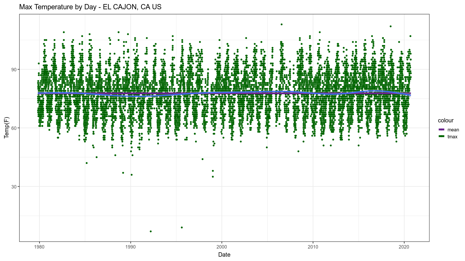
Second Level Analysis
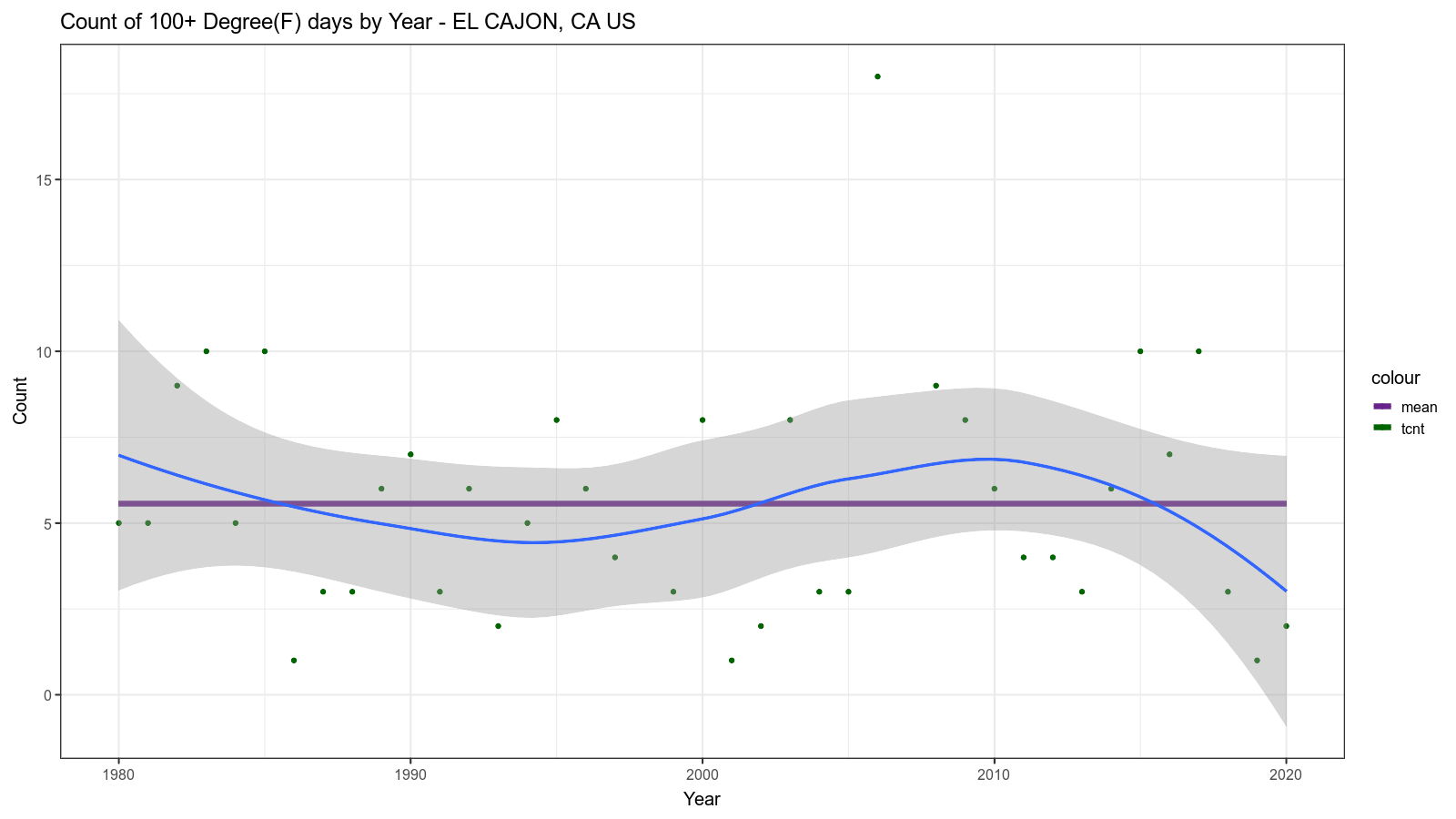
We have seen what the raw data looks like, which is a good start. But now we will dive a bit deeper using mostly good old SQL, although still wrapped by a PL/R function so that we can visualize the result. This function gives us a count of the days on which the maximum temperature was 100 degrees F or greater per year.
CREATE OR REPLACE FUNCTION count100plus
(
  stanum text,
  staname text,
  startdate date,
  enddate date
)
returns bytea AS $$
  library(RPostgreSQL)
  library(magick)
  library(ggplot2)

  fig <- image_graph(width = 1600, height = 900, res = 96)
  sqltmpl = "
     SELECT
       extract(isoyear from obs_date) AS year,
       count(tmax) as tcnt
     FROM temp_obs
     WHERE tmax is not null
     AND station = '%s'
     AND obs_date >= '%s'
     AND obs_date < '%s'
     AND tmax >= 100
     GROUP BY 1
     ORDER BY 1
  "
  sql = sprintf(sqltmpl, stanum, startdate, enddate)
  drv <- dbDriver("PostgreSQL")
  conn <- dbConnect(drv, user="postgres", dbname="demo",
                    port = "55610", host = "/tmp")
  data <- dbGetQuery(conn, sql)
  dbDisconnect(conn)
  data$mean_tcnt <- rep(mean(data$tcnt),length(data$tcnt))

  print(ggplot(data, aes(x = year)) +
   scale_color_manual(values=c("darkorchid4", "darkgreen")) +
   geom_point(aes(y = tcnt, color = "tcnt")) +
   geom_line(aes(y = mean_tcnt, color = "mean"), size=2) +
   labs(title = sprintf("Count of 100+ Degree(F) days by Year - %s", staname),
        y = "Count", x = "Year") +
   theme_bw(base_size = 15) +
   geom_smooth(aes(y = tcnt)))

  dev.off()
  image_write(fig, format = "png")
$$ LANGUAGE plr;

DO
$$
 DECLARE
  stanum text = 'USC00042706';
  staname text = 'EL CAJON, CA US';
  startdate date = '1979-10-01';
  enddate date = '2020-10-01';
  l_lob_id OID;
  r record;
 BEGIN
  for r in
   SELECT
    plr_get_raw(count100plus(stanum, staname, startdate, enddate)) as img
  LOOP
    l_lob_id:=lo_from_bytea(0,r.img);
    PERFORM lo_export(l_lob_id,'/tmp/count100plus.png');
    PERFORM lo_unlink(l_lob_id);
  END LOOP;
 END;
$$;
Everything here is essentially identical to rawplot() except for:
 sqltmpl = "
     SELECT
       extract(isoyear from obs_date) AS year,
       count(tmax) as tcnt
     FROM temp_obs
     WHERE tmax is not null
     AND station = '%s'
     AND obs_date >= '%s'
     AND obs_date < '%s'
     AND tmax >= 100
     GROUP BY 1
     ORDER BY 1
  "
This SQL statement does the core work of aggregating our count by year for days greater than or equal to 100 F.
The resulting image looks like this:
Third Level Analysis
Finally we will dive even deeper. This will need a bit of background.
Statistical Process Control
Years before computers were available (or they were people or mechanical devices and not electronics) Walter Shewhart at Bell Labs pioneered Statistical Process Control (SPC). It was later promoted and developed by Edwards Deming. See more about the history of SPC here. We won't go into any depth about all that, but let's just say that the following analysis is derived from SPC techniques.
The Central Limit Theorem
One of the premises of this type of analysis is that the data follows a normal distribution. To ensure at least an approximate normal distribution, SPC typically relies on the Central Limit Theorem. In other words, by grouping the raw data into samples, the resulting data tend toward the desired form.
Standard Scores
Another problem we need to solve with temperature data is that it changes seasonally. We cannot very well expect the maximum temperature in week 1 (early January) to be the same as week 32 (mid-August). The approach taken to deal with that is Standard Score or Z Score.
Overall Approach
Combining these things, the overall approach taken is something like this:
- For each week of all years in the dataset, by
ISO week number, determine the
average
tmax(xbor "x-bar") and the range oftmaxvalues (r). - For each week number (1-53), determine the overall average (sometimes called
the "grand average", or
xbb, or "x-bar-bar"), the average range (rbor "r-bar"), and the standard deviation (sd). - Standardize the weekly values using the per-week-number statistics.
- Combine all the weekly group data onto a single plot across all the years.
Custom Auto-loaded R Code
Please permit me another digression before getting into the "final" solution.
Sometimes there is R code that ideally would be common and reused by multiple
PL/R functions. Fortunately PL/R provides a convenient way to do that. A special
table, plr_modules, if it exists is presumed to contain R functions. These
functions are fetched and loaded into R interpreter on initialization. Table
plr_modules is defined as follows
CREATE TABLE plr_modules
(
  modseq int4,
  modsrc text
);
Where modseq is used to control order of installation and modsrc contains
text of R code to be executed. plr_modules must be readable by all, but it is
wise to make it owned and writable only by the database administrator. Note that
you can use reload_plr_modules() to force re-loading of plr_modules table
rows into the current session R interpreter.
Getting back to our problem at hand, the following will create an R function which can summarize and mutate our raw data in the way described in the previous section.
INSERT INTO plr_modules VALUES (0, $m$
obsdata <- function(stanum, startdate, enddate)
{
  library(RPostgreSQL)
  library(reshape2)

  sqltmpl = "
   WITH
   g (year, week, xb, r) AS
   (
     SELECT
       extract(isoyear from obs_date) AS year,
       extract(week from obs_date) AS week,
       avg(tmax) as xb,
       max(tmax) - min(tmax) as r
     FROM temp_obs
     WHERE tmax is not null
     AND station = '%s'
     AND obs_date >= '%s'
     AND obs_date < '%s'
     GROUP BY 1, 2
   ),
   s (week, xbb, rb, sd) AS
   (
     SELECT
       week,
       avg(xb) AS xbb,
       avg(r) AS rb,
       stddev_samp(xb) AS sd
     FROM g
     GROUP BY week
   ),
   z (year, week, zxb, zr, xbb, rb, sd) AS
   (
     SELECT
       g.year,
       g.week,
       (g.xb - s.xbb) / s.sd AS zxb,
       (g.r - s.rb) / s.sd AS zr,
       s.xbb,
       s.rb,
       s.sd
     FROM g JOIN s ON g.week = s.week
   )
   SELECT
    year,
    week,
    CASE WHEN week < 10 THEN
     year::text || '-W0' || week::text || '-1'
    ELSE
     year::text || '-W' || week::text || '-1'
    END AS idate,
    zxb,
    0.0 AS zxbb,
    3.0 AS ucl,
    -3.0 AS lcl,
    zr,
    xbb,
    rb,
    sd
   FROM z
   ORDER BY 1, 2
  "

  sql = sprintf(sqltmpl, stanum, startdate, enddate)

  drv <- dbDriver("PostgreSQL")
  conn <- dbConnect(drv, user="postgres", dbname="demo", port = "55610", host = "/tmp")
  data <- dbGetQuery(conn, sql)
  dbDisconnect(conn)

  data$idate <- ISOweek::ISOweek2date(data$idate)

  return(data)
}
$m$);
SELECT reload_plr_modules();
There is a lot going on in that R function, but almost all the interesting bits are in the templatized SQL. The SQL statement builds up incrementally with a series of Common Table Expressions (CTEs). This is a good example of how powerful native PostgreSQL functionality is.
Before examining the SQL statement, another quick side-bar. Note the use of
$m$ around the R code. The encapsulated R code is a
Dollar-Quoted String Constant.
Dollar quoting is particularly useful when dealing with long string constants
that might have embedded quotes which have meaning when the string gets
evaluated. Rather than doubling the quotes (or doubling the doubling, etc.), two
dollar signs with a "tag" of length zero or more (in this case "m") in between
are used to delimit the string. If you were paying attention, you might have
already noticed the $$ delimiters used in the previous PL/R function
definitions and even in the DO statements, for the same reason. This is one of
the coolest unsung features of PostgreSQL in my humble opinion.
Anyway, the first stanza
 g (year, week, xb, r) AS
  (
    SELECT
      extract(isoyear from obs_date) AS year,
      extract(week from obs_date) AS week,
      avg(tmax) as xb,
      max(tmax) - min(tmax) as r
    FROM temp_obs
    WHERE tmax is not null
    AND station = '%s'
    AND obs_date >= '%s'
    AND obs_date < '%s'ß
    GROUP BY 1, 2
   ),
Is finding our weekly average and range of the daily maximum temperatures across all the years of the selected date range for the selected weather station.
The second stanza
 s (week, xbb, rb, sd) AS
  (
    SELECT
      week,
      avg(xb) AS xbb,
      avg(r) AS rb,
      stddev_samp(xb) AS sd
    FROM g
    GROUP BY week
   ),
takes the weekly summarized data and further summarizes it by week number across all the years. In other words, for week N we wind up with a grand average of daily maximum temperatures, and average of the weekly maximum temperature ranges, and the standard deviation of the weekly average maximum temperatures. Whew that was a virtual mouthful. Hopefully the explanation was clear enough. The assumption here is that for a given week of the year we can reasonably expect the temperature to be consistent from year to year, and so these statistics will help us see trends that are non-random across the years.
The third stanza
  z (year, week, zxb, zr, xbb, rb, sd) AS
   (
     SELECT
       g.year,
       g.week,
       (g.xb - s.xbb) / s.sd AS zxb,
       (g.r - s.rb) / s.sd AS zr,
       s.xbb,
       s.rb,
       s.sd
     FROM g JOIN s ON g.week = s.week
   ),
calculates standard score values for the per-week data. In other words, the data is rescaled based on distance in "standard deviations" from the grand average. This in theory at least, allows us to meaningfully compare data from week 1 to week 32 for example.
The final stanza
  SELECT
    year,
    week,
    CASE WHEN week < 10 THEN
     year::text || '-W0' || week::text || '-1'
    ELSE
     year::text || '-W' || week::text || '-1'
    END AS idate,
    zxb,
    0.0 AS zxbb,
    3.0 AS ucl,
    -3.0 AS lcl,
    zr,
    xbb,
    rb,
    sd
   FROM z
   ORDER BY 1, 2
pulls it all together and adds a few calculated columns for our later convenience when we plot the output.
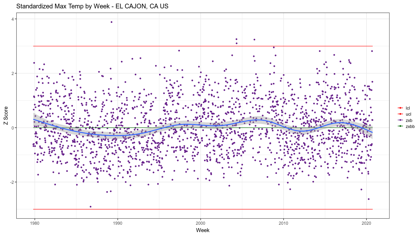
The Final Plot Functions
Now we can finally create the functions which will produce pretty plots for the third level analytics.
CREATE OR REPLACE FUNCTION plot_xb
(
stanum text,
staname text,
startdate date,
enddate date
)
returns bytea AS $$
library(magick)
library(ggplot2)
data <- obsdata(stanum, startdate, enddate)
fig <- image_graph(width = 1600, height = 900, res = 96)
print(ggplot(data, aes(x = idate)) +
scale_color_manual(values=c("red", "red", "darkorchid4", "darkgreen")) +
geom_point(aes(y = zxb, color = "zxb")) +
geom_line(aes(y = zxbb, color = "zxbb")) +
geom_line(aes(y = ucl, color = "ucl")) +
geom_line(aes(y = lcl, color = "lcl")) +
labs(title = sprintf("Standardized Max Temp by Week - %s", staname),
y = "Z Score", x = "Week") +
theme_bw(base_size = 15) +
theme(legend.title=element_blank()) +
geom_smooth(aes(y = zxb)))
dev.off()
image_write(fig, format = "png")
$$ LANGUAGE plr;
DO
$$
DECLARE
stanum text = 'USC00042706';
staname text = 'EL CAJON, CA US';
startdate date = '1979-10-01';
enddate date = '2020-10-01';
l_lob_id OID;
r record;
BEGIN
for r in
SELECT
plr_get_raw(plot_xb(stanum, staname, startdate, enddate)) as img
LOOP
l_lob_id:=lo_from_bytea(0,r.img);
PERFORM lo_export(l_lob_id,'/tmp/plot_xb.png');
PERFORM lo_unlink(l_lob_id);
END LOOP;
END;
$$;
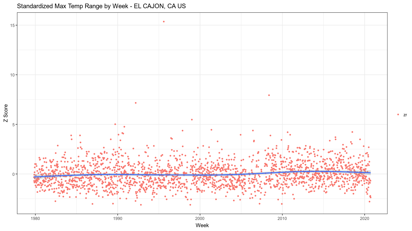
CREATE OR REPLACE FUNCTION plot_r
(
stanum text,
staname text,
startdate date,
enddate date
)
returns bytea AS $$
library(magick)
library(ggplot2)
data <- obsdata(stanum, startdate, enddate)
fig <- image_graph(width = 1600, height = 900, res = 96)
print(ggplot(data, aes(x = idate)) +
geom_point(aes(y = zr, color = "zr")) +
labs(title = sprintf("Standardized Max Temp Range by Week - %s", staname), y = "Z Score", x = "Week") +
theme_bw(base_size = 15) +
theme(legend.title=element_blank()) +
geom_smooth(aes(y = zr)))
dev.off()
image_write(fig, format = "png")
$$ LANGUAGE plr;
DO
$$
DECLARE
stanum text = 'USC00042706';
staname text = 'EL CAJON, CA US';
startdate date = '1979-10-01';
enddate date = '2020-10-01';
l_lob_id OID;
r record;
BEGIN
for r in
SELECT
plr_get_raw(plot_r(stanum, staname, startdate, enddate)) as img
LOOP
l_lob_id:=lo_from_bytea(0,r.img);
PERFORM lo_export(l_lob_id,'/tmp/plot_r.png');
PERFORM lo_unlink(l_lob_id);
END LOOP;
END;
$$;
Compared to some of the preceding examples, this code is relatively simple. That
is in large part thanks to our use of the plr_modules table to auto-load
common R code.
The resulting images look like this:
Summary
This episode turned out longer than I envisioned, but I wanted to be sure to get into enough detail to help you understand the code and the thinking behind it. Hopefully you persevered and are glad that you did so. My aim was to introduce you to some of the ways PostgreSQL and its ecosystem can be useful for Data Science. If you want to try this out for yourself, you can do so using Crunchy Bridge. I am planning to do several more installments as part of this series, so stay tuned for more!
